Table of Contents
How to describe this image:
Describe this line graph by focusing on the data. There are 3 key pieces of information that the student needs, how much time has elapsed, what is the temperature of the water and what is the state of the water.
If you are reading it aloud, convert the graph brief bullet points as show below in Option 1.
Bet yet, would be to convert the graph into an accessible HTML data table to give the student independent access to the data as shows in Option 2.
Description:
Option 1- when being read aloud
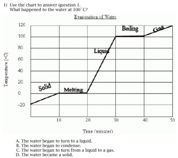
A chart titled Evaporation of Water shows changes in water as temperature increases over time.
0 minutes to 10 minutes. Temperature increases from -20C to 0C. Water is solid.
10 min to 20 min. Temperature holds at 0C. Water is melting.
20 min to 30 min. Temperature increases from 0C to 100C. Water is liquid.
30 min to 40 min. Temperature holds at 100C. Water is boiling.
40 min to 50 min. Temperature increases from 100C to 120. Water is gas.
Option 2 - when delivered in a digital format (eg, webpage, DAISY, DTB)
A chart titled Evaporation of Water shows changes in water as temperature increases over time. The data is represented in the following table.
| Time | Temperature | Water |
|---|---|---|
| 0 minutes to 10 minutes | Temperature increases from -20C to 0C | Water is solid |
| 10 min to 20 min | Temperature holds at 0C | Water is melting |
| 20 min to 30 min | Temperature increases from 0C to 100C | Water is liquid |
| 30 min to 40 min | Temperature holds at 100C | Water is boiling |
| 40 min to 50 min | Temperature increases from 100C to 120 | Water is gas |
Funding for this project is from the U.S. Department of Education to the Utah State Office of Education under Grant Award #S368A090019. Any opinions, findings, and conclusions or recommendations are those of the project team and do not necessarily reflect those of the U.S. Department of Education.
Contact NCAM
NCAM at GBH
One Guest Street
Boston, MA 02135